Bio Alchemy Olfactive
Brand Identity, Design,
Image Direction and Execution
Image Direction and Execution
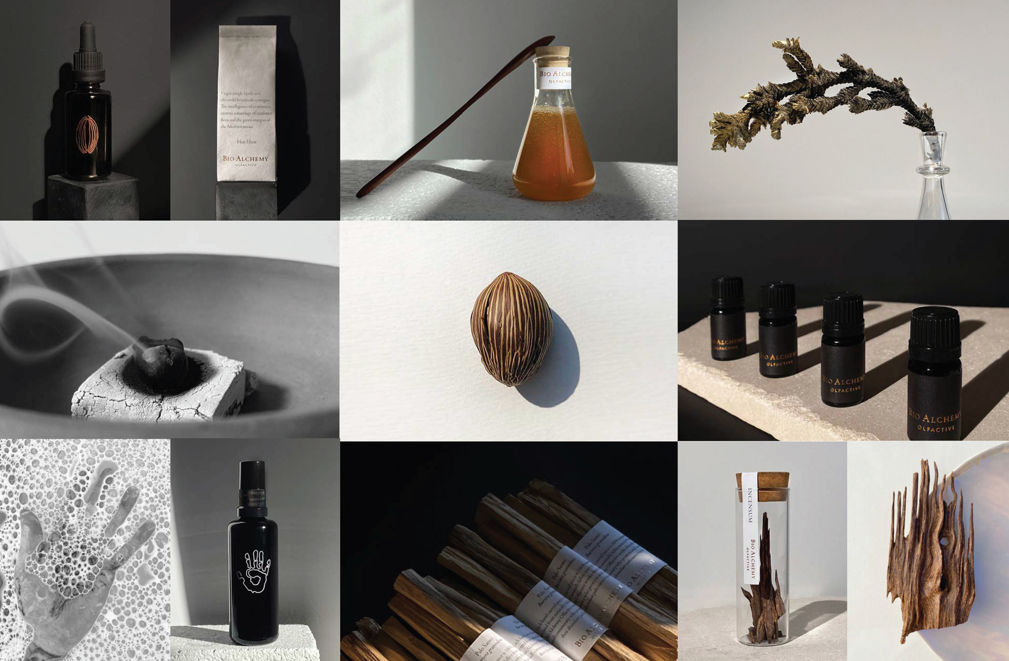
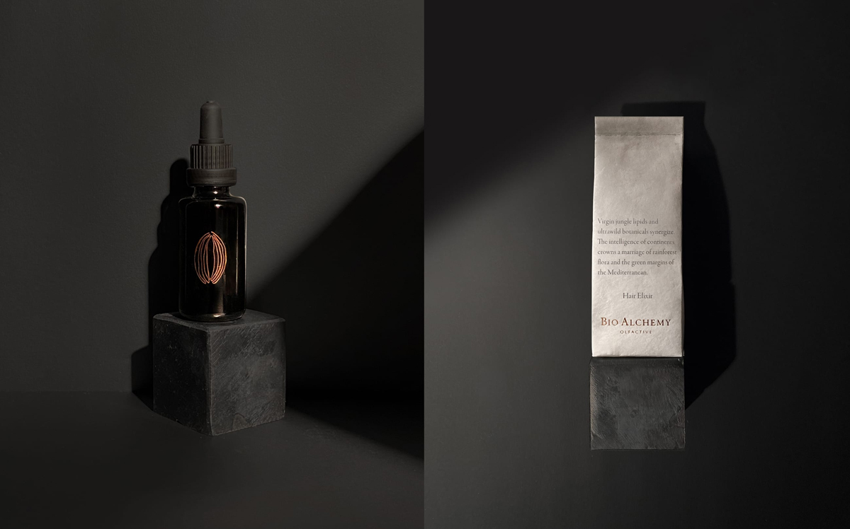
Bio Alchemy Olfactive is an environmentally focused aromatic lifestyle project forging meaningful connections between humanity and earth through expertly sourced botanicals. Here we devised a visual language that came from science and nature, but articulated through a lens of storytelling and familiarity, with sophisticated andintellectual design and image applications highlighting key information. To keep that intellectual approach, we used clean typography and lines communicating the brand’s mission and ethos. The general idea is to enlist imagination under the banner of science. Drawing and bottle design for skin nectar, one of thebrand’s hero products, symboles the vibrational energy of a flower. In this case particularly, a rose, which is an integral part of this formula. Final design of this flower is applied in copper which is the color and metal element of the brand, inspired by the copper stills that have been used for the last century to extract from these beautiful gifts of nature. Drawn with one single line, from its conception to its singularity. This conceptual approach and application is translated across all designs within the brand’s product line.


